How do you design a logo for an academic research project that covers olfactory heritage, history, artificial intelligence….and looks good? Caro Verbeek, olfactory art historian, interviewed Kate McLean lecturer, artist, designer, and researcher of Sensory Maps on how she created the visual logo for Odeuropa.

You are famous for designing smell maps and guiding scent walks. What exactly are these and why do you engage in them?
Smell maps, or smellscape maps, are depictions of human olfactory experience in a place at a moment in time. The data (smells) depicted on the maps is collected by inhabitants of the city being mapped through a process known as smell walking. Smell walking is a walk in which you register what you smell in preference to what you see or hear – a deliberate foregrounding of the nose as the sense of primary information (for a short period of time).
You designed a visual identity or logo for Odeuropa. What were the major challenges?
The major challenge in designing a logo for Odeuropa was how to depict a project at its onset… the Odeuropa project was funded precisely because it covers ground not previously explored; use of AI, focus on smell, digital and physical, history and future archive. The other challenge was to understand the smellmark as a part of the identity and to complement what Frank Bloem’s work communicates.
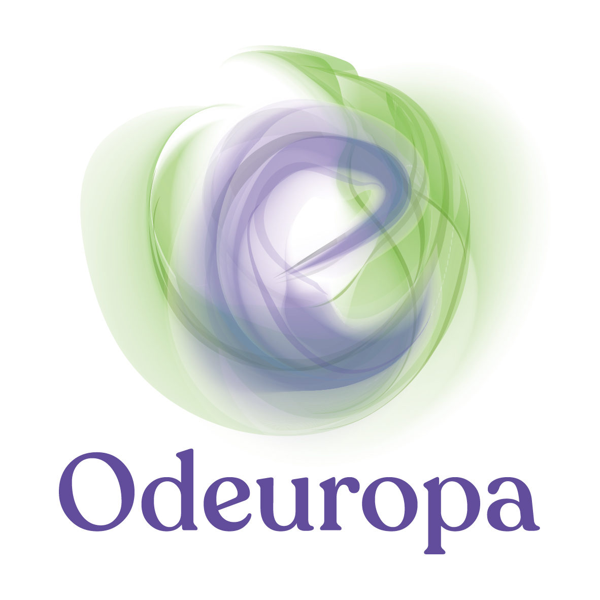
How did you afford the logo ‘smellability’?
The logo’s smellability derives from its wafting forms that make up an “O” and an “e” – the fluid, soft edged strokes are designed to resemble smoke, which is the closest visual conceptual link humans have for smell – we can imagine smoke manifest and swirl. The green and purple colours are complementary to signify the various dualities within the project.
Your logo is part of a multi-sensory whole. How do the visual aspects connect to the olfactory ones (by Frank Bloem)?
Frank Bloem’s smellmark takes its inspiration from the letters of the word Odeuropa, as does the logo… the connection between visual and olfactory is through letter forms – apposite for a project which will analyse texts.